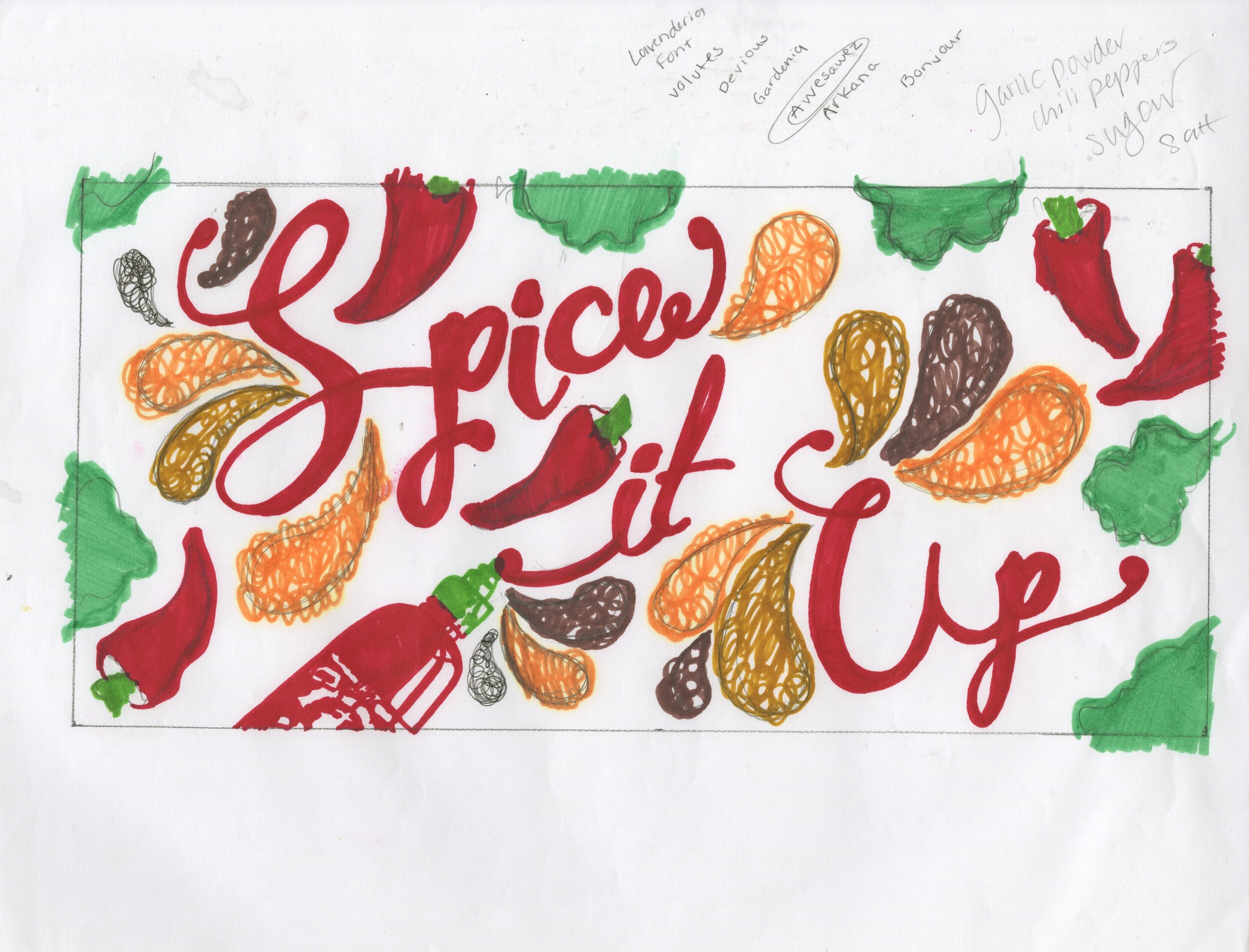
Spice It Up with Sriracha
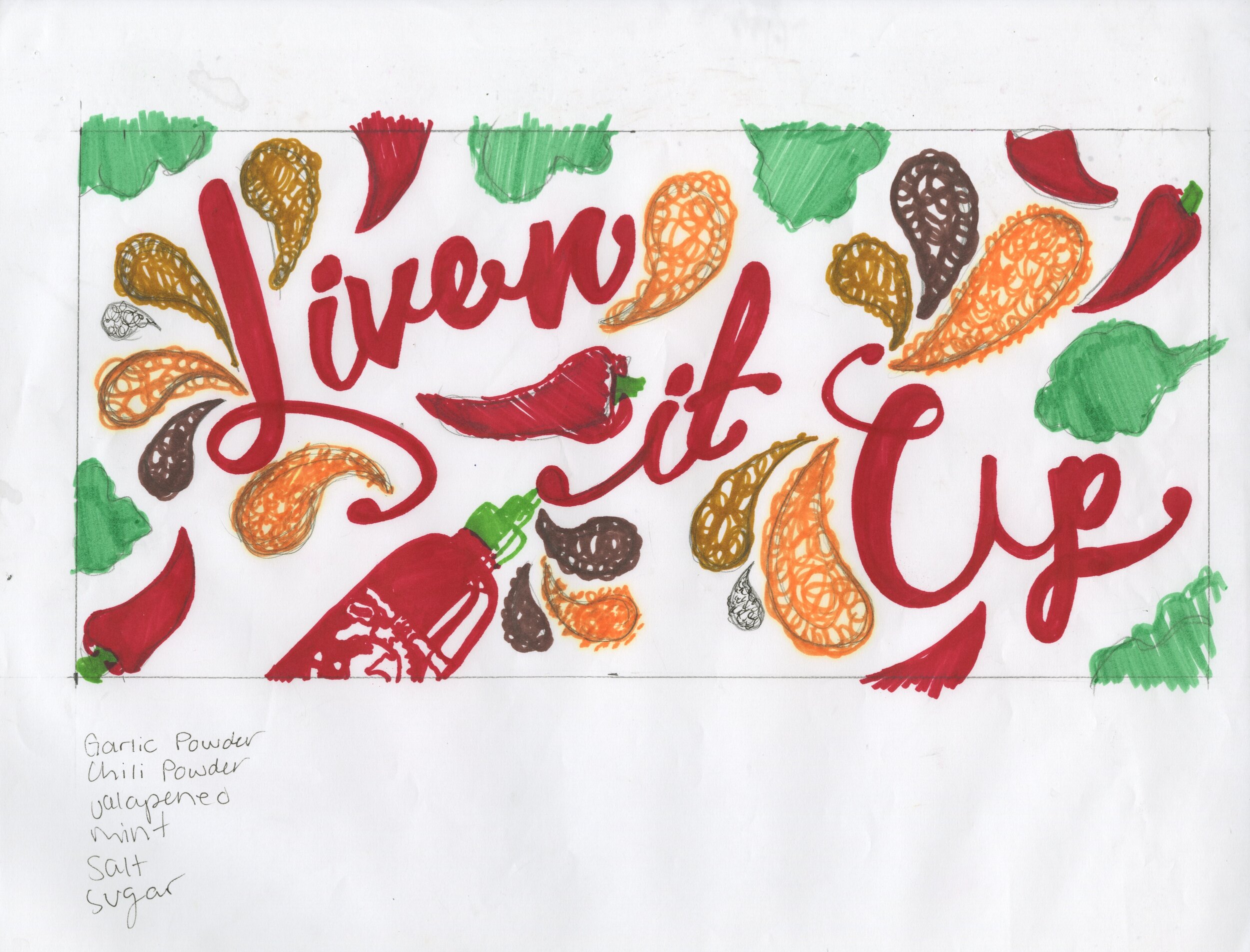
Hand Lettering
Photography
Awards and Recognition:
This campaign was named a 2017 Adobe Design Achievement Award
Semi-Finalist and awarded a Merit in the Graphis New Talent Annual 2018.
Many young adults in their 20s and early 30s still eat comfort foods like ramen and mac and cheese reminiscent of their college days. This outdoor advertising campaign encourages them to “spice it up” and try more adventurous ingredients. Using hand done typography created with actual Sriracha sauce and spices a new personality for this brand was created that will have everyone excited about eating adventurously.
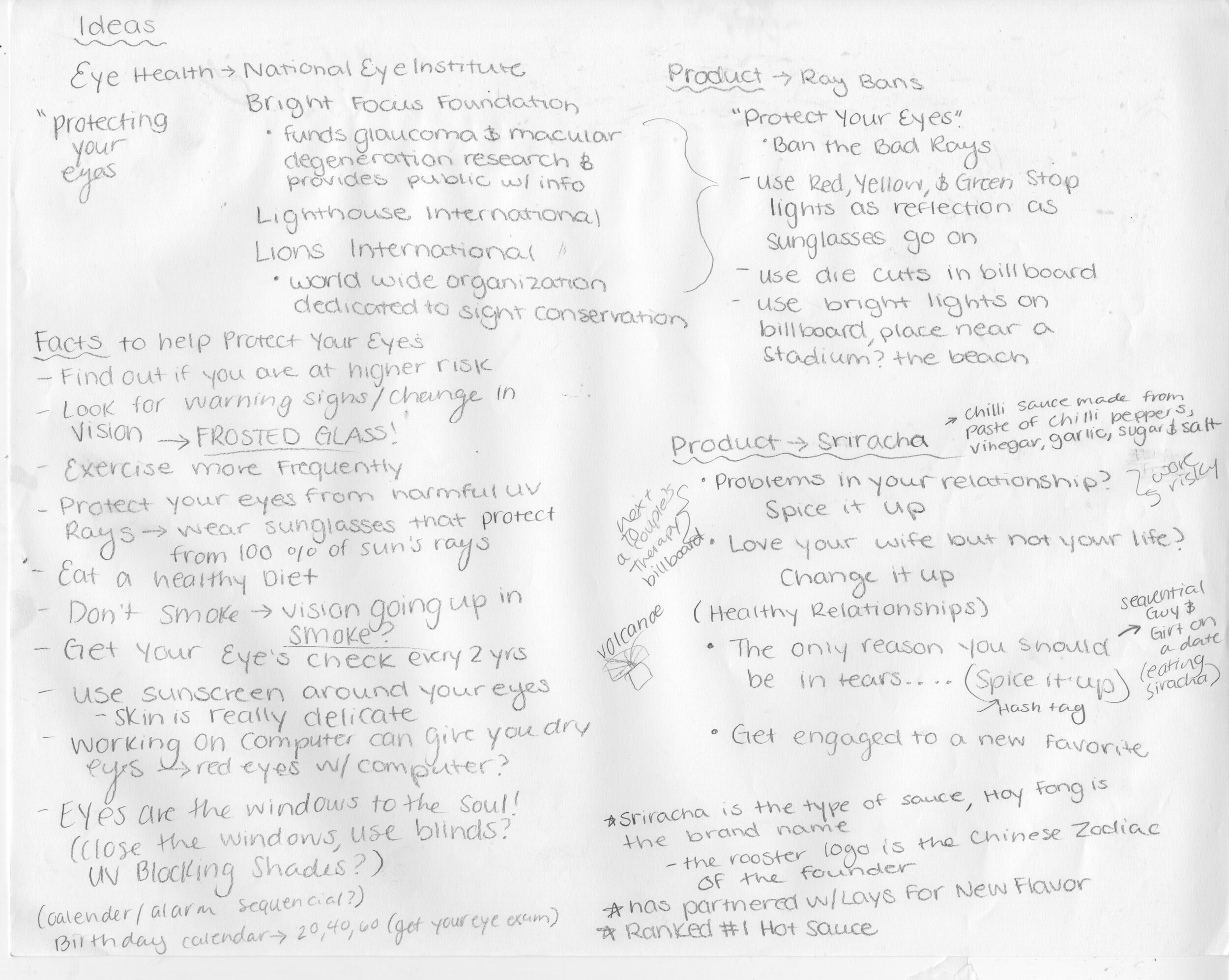
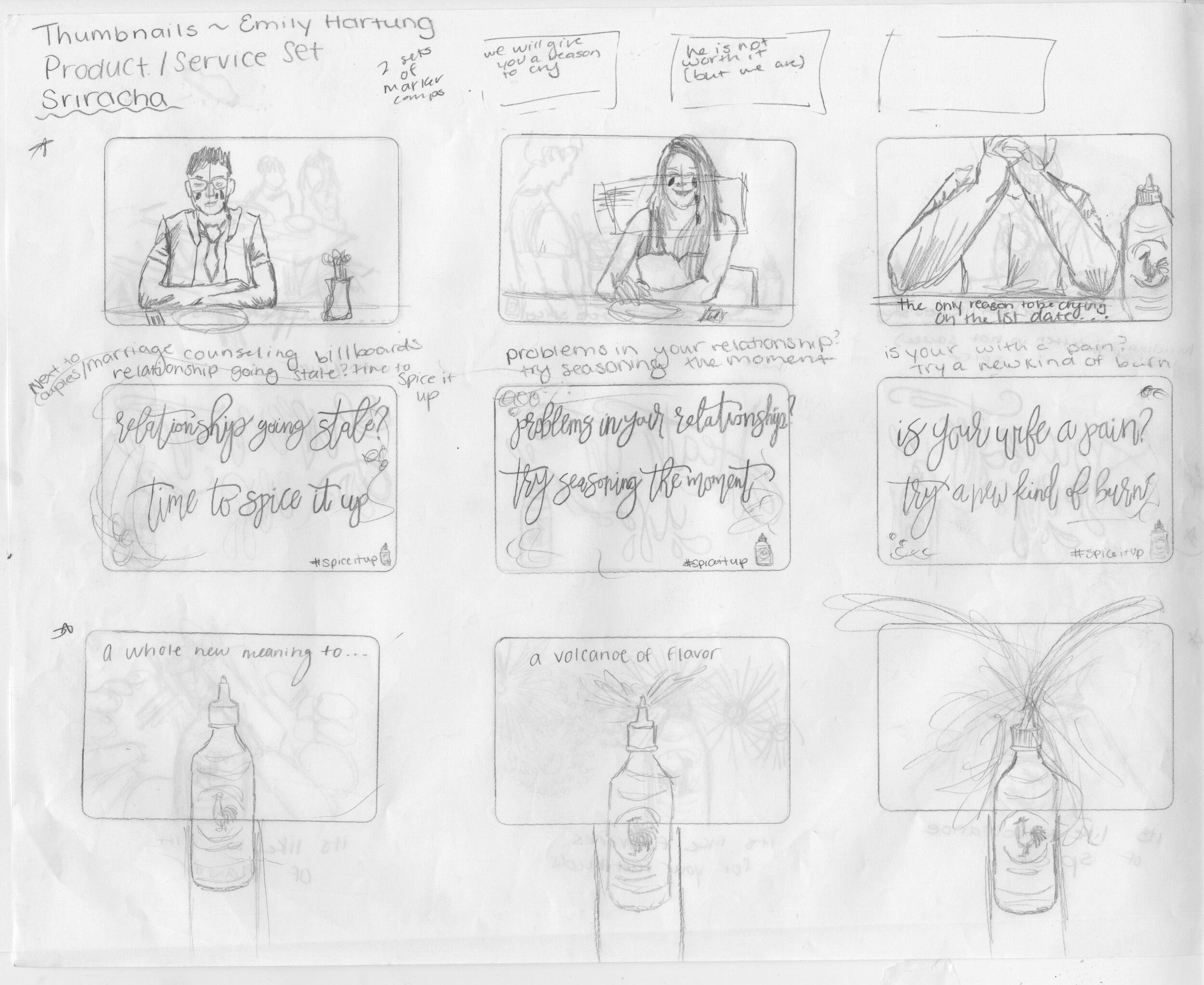
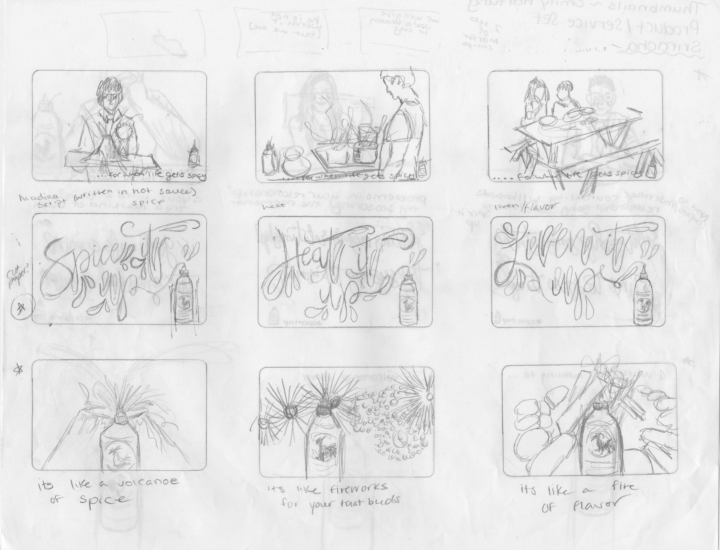
Figuring Out How to Spice It Up

Project Created For Educational Purposes.


